


A How-to Guide for Beginners

Introduction to Salesforce Reporting
Salesforce offers a wide range of tools to improve business processes. One of its most valuable features is the ability to run reports. The beauty of this is that you don’t need to be a data analyst to get the insight you need. This Beginner’s Guide to Salesforce Reporting will explore the basics of creating, customizing, and visualizing data with Salesforce reports. There’s a tutorial at the end of this to help walk through the process, so stay tuned!
What is Salesforce Reporting?
Salesforce is one big database. Naturally, Salesforce allows users to extract and analyze this data through its reporting feature. Reports present data in an organized format that’s easy to understand, enabling users to visualize trends, look for opportunities, and identify problems.
Why Should Beginners Learn About Salesforce Reporting?
Employee or manager, you should learn how to run reports in Salesforce. Success in any business requires regular reflection on activities, strategizing resources, and presenting findings to the rest of the organization. In a world without Salesforce, this would have been done with pivot tables and graphs, which is not easy for every employee. Salesforce reporting empowers everyone to be data-driven.
Creating Your First Salesforce Report
Accessing the Report Builder
There should be a tab labelled “Reports” on the menu. Similar to how you access Opportunities or Contacts. If this tab is unavailable, you must ensure you are in the right App and have the proper permissions. If you aren’t sure, ask your Salesforce Admin for help.
Click on the “New Report” button to start building your report.

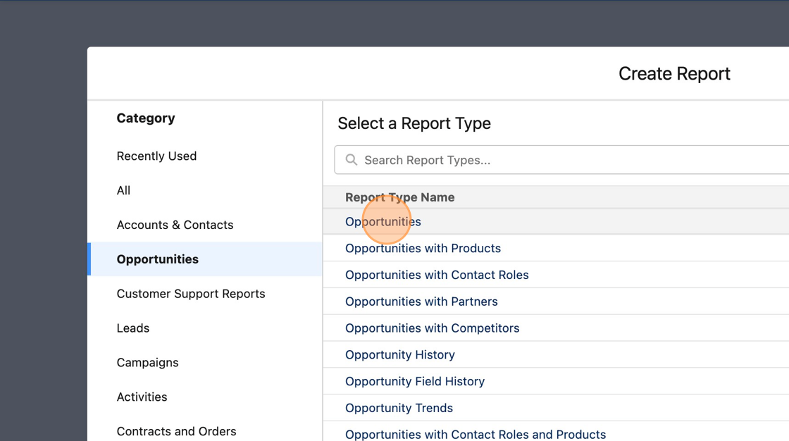
Choosing the Right Report Type
Before creating a report, you must select the appropriate report type. A report type decides two things:
Which records you’d like to view in the report
The fields to access, display, and manipulate
Do you want to report on Opportunities? How about the contacts or products associated with the Opportunity? This is very important because choosing the right report type will decide how your report will look like.
Be warned because the Report Type cannot be changed once selected!
Navigating and Customizing Reports
Now that you’ve created your first report let’s explore the features available to tailor your reports to your specific needs.
Exploring the Report Builder Interface
Salesforce has done a great job in building an easy-to-understand interface for reporting. Let’s go through some of the most useful features for beginners:
Outline: The outline tab is where you select the fields you want to display. You can also arrange the columns of the report and group the data here.
Filters: Click on the filters to access and add new filters to the report.
Show Fields: Browse through the list of fields available.
Update Preview Automatically: Toggle “On” the update preview automatically button to see the changes you make to the preview instantly.
Save & Run: Save a step through this button to save the report and run it right away.

Adding and Removing Columns
In the Outline tab, add or remove fields under the Columns section. You can also drag and drop fields to move them around. Tailor your report to focus on the most relevant information.

Group Data in Reports
Grouping is commonly used to categorize the data a certain way. For example, you may want to group Opportunity records by their Stage to understand the existing pipeline. There’s 3 ways to do this.
Search the field in the Add Group search bar
Drag and Drop the field from the Columns section to the Groups
Click on the arrow beside the field that you want to group, and choose “Group Rows by This Field”.

Filtering Data in Salesforce Reports
Filtering is a powerful way to refine your reports and zero in on the exact data you need. Apply filters to focus on specific records or criteria that match your analysis goals.

Visualizing Data with Charts
One of my favorite aspects about Salesforce reporting is the ability to draw up charts with a single click of a button. Visual representations of data make it easier to understand trends and patterns. Simply click on the Toggle Chart button to access your chart. Choose from a variety of different chart types that best fits your needs.

Step-by-Step Tutorial
Here’s an interactive tutorial
** Best experienced in Full Screen (click the icon in the top right corner before you begin) **

Creating a Salesforce report from scratch. A walkthrough guide.
Top 3 FAQs about Reporting
It’s completely normal to run into issues when reporting. Here are some FAQs and solutions to help you troubleshoot and resolve them.
Why can’t my team members see my report?
In Salesforce, the sharing permissions of the folder dictate who can access the report inside of it. This means it’s important to save the report in the correct folder. Users often save the report into a private folder and share it with other employees, which will not open.
I can’t see certain fields
The permission rules of the user travel to reports. This means if there’s data that you aren’t allowed to access, you won’t see it in the report as well. This can include fields, records, and other related objects.
I have to make the same report every week. Can I automate this?
There’s multiple ways to go about this, but the easiest method is to create a dynamic report. Set your date filter to a relative value like “LAST WEEK,” and you will be able to use the same report every week to view the data from the previous week.
Conclusion
Salesforce can be a tricky tool, but remember that this is a tool designed to empower you. By analyzing your data effectively, you can boost efficiency, productivity, and gain a deeper understanding of your organization’s performance. Don’t be afraid to practice and experiment with creating new ways to run reports. You’ve done all the work to ensure that your team collects the right data so make sure to take full advantage of it.
If you’d like to enable your team members to be better with Salesforce data, talk to us! We would love to help you empower your business.